New edition spec
July 2015
Body
Hi,
Those of you familiar with Stanley Donwood's work will know that he's a genius when it comes to packaging – in 2002, Donwood and ThomYorke won a Grammy Award for Best Recording Package for the Special Edition for the album Amnesiac.
In his first book with Tangent, Slowly Downward, my colleague Steve Faragher arranged to print the endpapers on an opaque paper stock, the idea being that the image faded slightly from front to back. It kinda worked. But it took two weeks for the endpapers to dry at the printers.
In Household Worms, Donwood wanted to create an 'invisible' book, so we debossed the cover ever so slightly and printed the book the Old Penguin B format size so it could easily slip into a jacket pocket. The idea was that the book would feel slightly worn, as though it had always been in the pocket, that it was 'invisible.' Try it, it works.
Also the book is thread sewn, so when it eventully falls apart, it will do so in sections - each one containing a number of complete short stories.
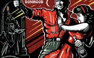
Catacombs of Terror! is the opposite of Household Worms. It's big and brash, an airport novel. Donwood commissioned Chris Hopewell from Jacknife in Bristol to design the cover because of his expertise and deep knowledge of pulp fiction art. It's a wonderful piece of work based on the fonts and motifs of the 1950s pulp fiction genre.
We discussed various options to complete the 'package' and came up with a little-used technique called edge colouring, it's most commonly used on diaries and hymn books where the outward edges of the folios are coloured (usually gold). We've looked at samples and if we can get the right effect, the result will be stunning…
Please enourage others to pledge and share.
https://www.fundsurfer.com/project/catacombs-of-terror-by-stanley-donwood